Putting the spotlight on a dynamic new brand.
Using a creative, flexible approach, we created a new brand for Lincolnshire and Yorkshire’s newest, largest law firm. Here’s how we did it…
Wilkin Chapman Rollits.
Art direction
Branding and design
Photography
Production
Challenge.
Two of Lincolnshire and Yorkshire’s largest and most established law firms - Wilkin Chapman and Rollits - were planning a merger and required a new brand, visual identity and look and feel.
It needed to be dynamic, fresh and a true reflection of the new firm and its exciting future.
Not only that, it needed to be versatile and flexible enough to be used across a variety of digital and print assets - ranging from video content and digital billboards to letterheads and compliment slips.
And with tight timescales, this all had to be completed within weeks ready to launch on the day of merger.


Response.
We responded with a new creative concept, producing a full design suite, brand guidelines and rollout plan to see the new design launched across a number of channels.
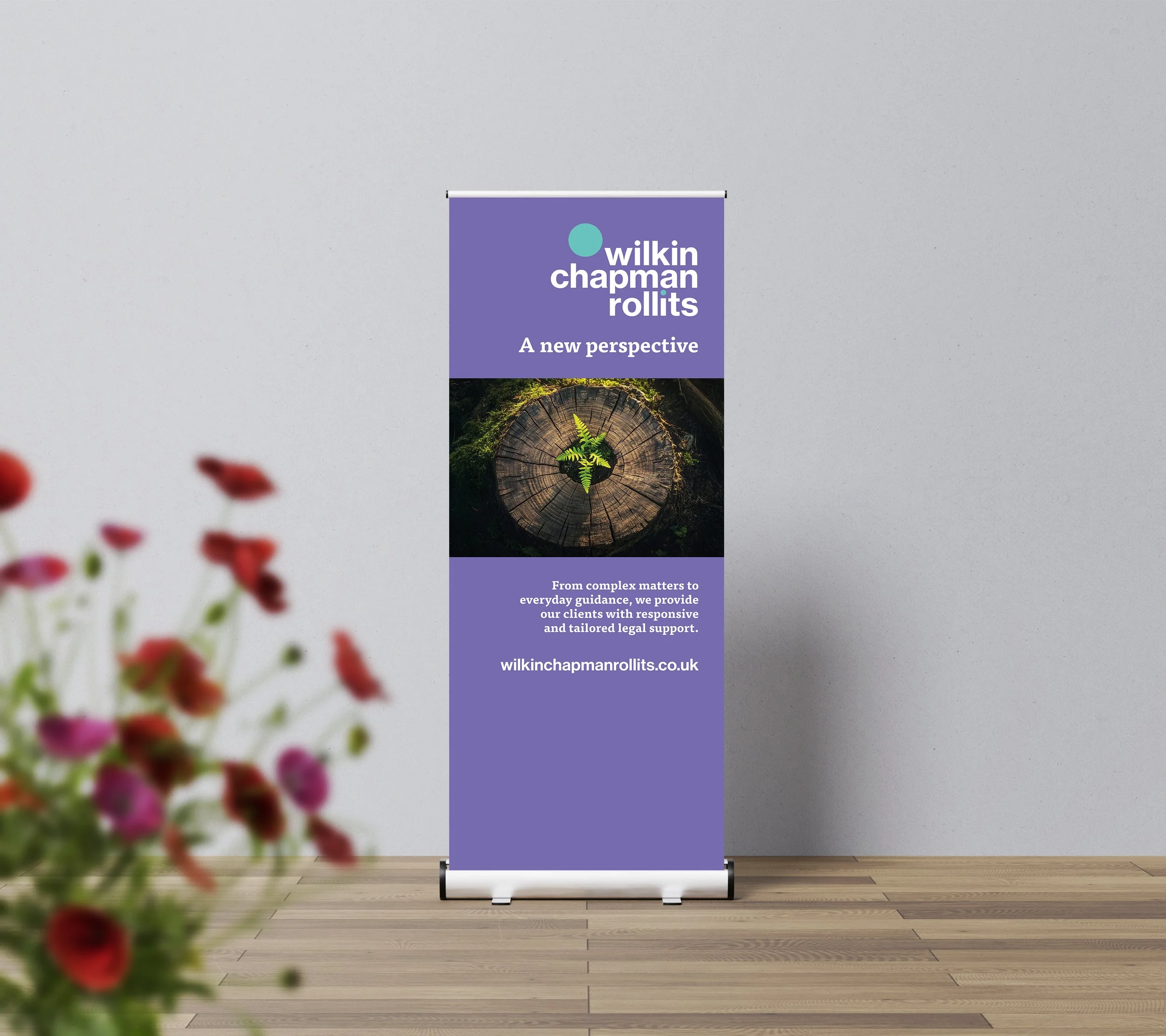
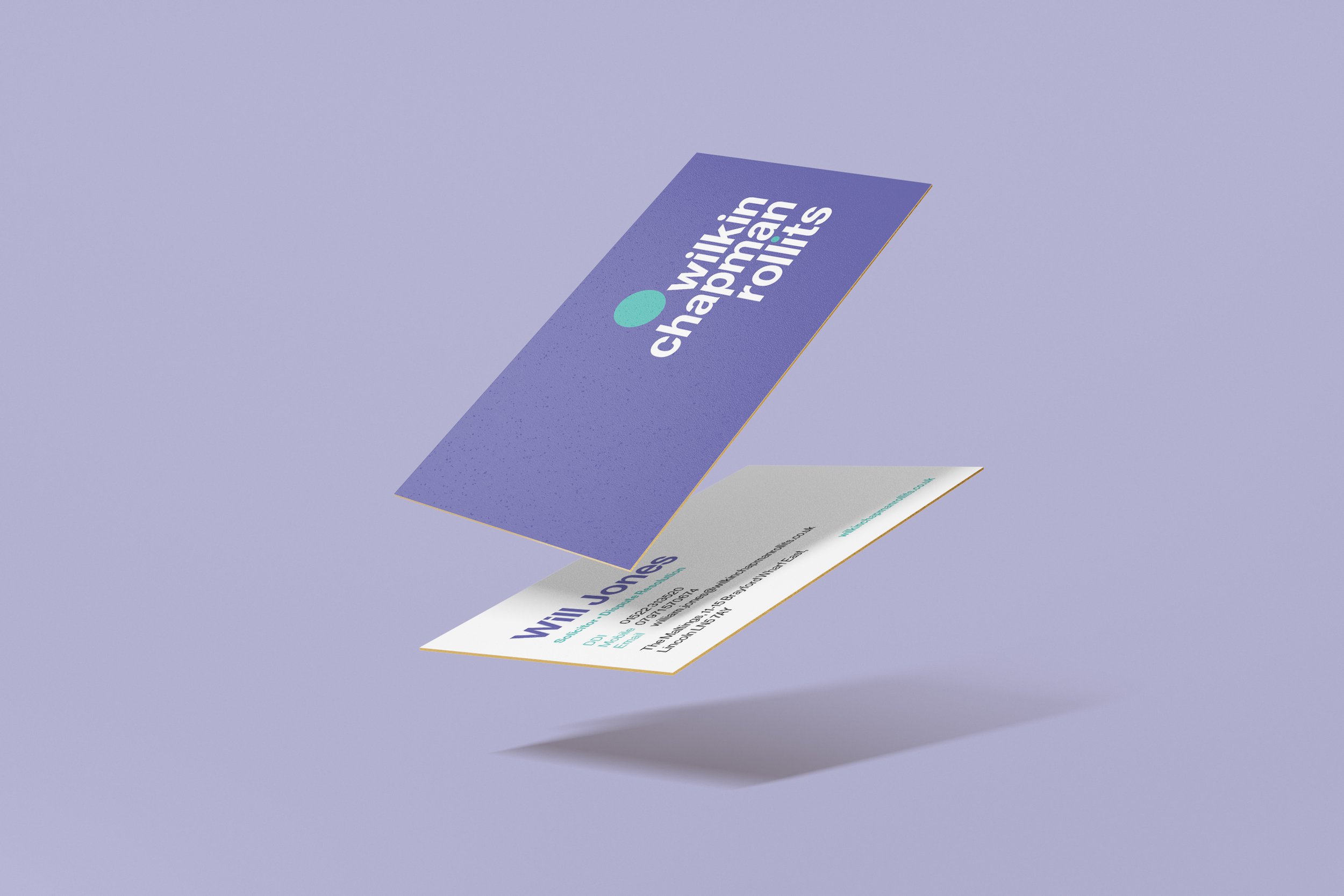
At the heart of the brand was a ‘spotlight’ - a circular motif representing focused attention.
Symbolising unity and trust, this is complemented by a new heather and teal colour palette and a clean sans-serif font to add a contemporary, readable and professional look.
All photography was reviewed and updated in-line with the new brand and spotlight focus. A launch video was also created, bringing the new brand to life.


Results.
The new brand launched on time across all required formats, internally and externally, including: website; social media channels; brochures; signage; intranet; stationery; pens; water bottles; legal documentation and IT systems.
PR support saw coverage in key business and trade titles, bringing the news to clients and potential clients across the region and beyond.
CEO of Wilkin Chapman Rollits, Robin Simmonds, said: “...we’re delighted with the results. We now have a brand that not only represents the coming together of the two firms but also reflects our future ambition.
In a short space of time Pace has delivered everything we asked of them and more and the team has been a pleasure to work with.”