A brand that is unafraid to evolve

There are few brands as ubiquitous in UK agency studios as GF Smith. The Hull-based paper merchant's distinctive Colorplan book is a common sight in creative workspaces across the industry - however, earlier this spring the firm unveiled a bold new identity.
Whereas its previous branding, designed in 2014, embraced GF Smith's reputation as a premium brand with a refined, minimalist and heritage-focused identity, the new look is one firmly built on vibrancy and playfulness.
To say that the move has been divisive would be something of an understatement.
Whilst some responses were positive, there were just as many expressing skepticism, with comments on the company's social channels describing the new look as 'cheap', 'visually upsetting' and even 'an insult'.
Integrating print with digital
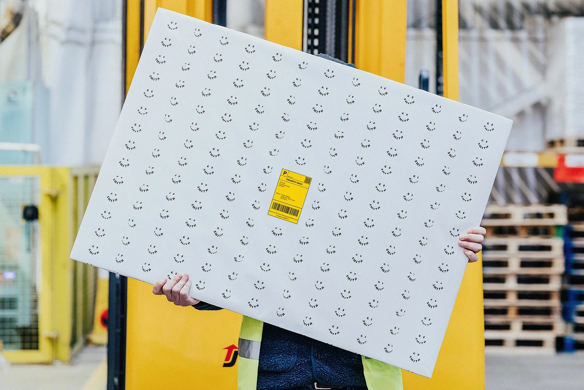
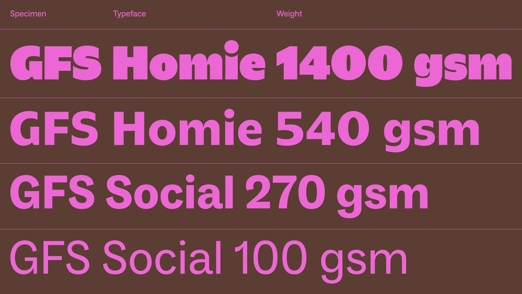
At the heart of the new identity is the updated GF Smith logo. Gone is the refined sans serif of old, replaced with a smile built from a chunkier, friendlier custom typeface - a simple but bold visual device which lends a warmth and friendliness, literally serving as a 'human face' of the brand.
However, the logo isn't just a static mark - it's designed for movement and play and readily adjusts to different contexts and orientations. Nowhere is this better seen than on the company's updated website, which is now packed with movement and animation and has a much more dynamic feel compared to its predecessor.
On first view, making motion such a key part of the identity may seem something of an odd choice given the inherently static nature of the product. However, the rebrand is seeking to integrate print with digital and uses animation and motion graphics to try and express the tactility of paper in an immersive way.


The importance of typography
Typography is of course a critical factor in any brand identity - whereas previously GF Smith had opted for a thin, elegant wordmark, the rebrand utilises a more solid bespoke typeface designed with friendliness and approachability in mind.
How the text itself is applied has also seen something of a change - whilst straight type still dominates to ensure legibility and clarity, the new identity sees the introduction of curved text. Although it's used somewhat sparingly, where it appears it hints at the physical nature of paper itself and the curves and folds of the material.
Embracing a wider colour palette
Another key feature of the rebrand is an increased use of colour.
Rather than limiting itself to a narrow set of hues, the new identity embraces a wider, more expressive colour palette sourced directly from GF Smith's papers, in particular its famous Colorplan range.
This bold use of colour doesn't just add a sense of energy and fun to the new identity - it also serves as a shop window to the company's paper ranges and highlights its reputation for producing vibrant colour, helping to set it apart from its competitors.

Being unafraid to evolve
Whilst such a significant change has provoked mixed reactions, there is a general agreement that the rebrand does stand out for its boldness.
In an industry that lends itself to traditional, heritage-based brands, GF Smith has certainly shown a willingness to take a risk and as a result has developed an identity positioning itself as energetic and daring, and which shows a company unafraid to evolve and reinvent itself.
Explore some of Pace’s brand development projects here.